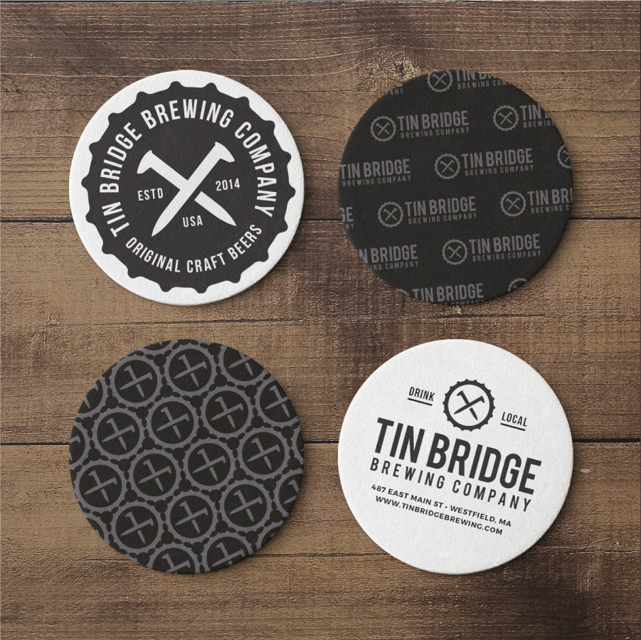
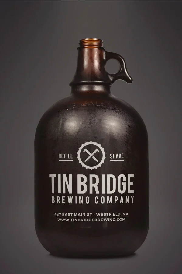
The main lettering uses a clean, uniform, and strong typeface to emphasize the stability and strength of the brand. The railroad spikes symbolize Tin Bridge as a historic railway as well as representing the two brothers coming together in collaboration to start their brewery.


